I was trying to simulate "Sampling Distribution of Sample Proportions" using Python. I tried with a Bernoulli Variable as in example here
The crux is that, out of large number of gumballs, we have yellow balls with true proportion of 0.6. If we take samples (of some size, say 10), take mean of that and plot, we should get a normal distribution.
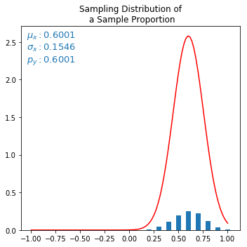
I have managed to obtain the sampling distribution as normal, however, the actual normal continuous curve with same mu and sigma, does not fit at all, but scaled to few factors up. I am not sure what is causing this, ideally it should fit perfectly. Below is my code and output. I tried varying the amplitude and also sigma (dividing by sqrt(samplesize)) but nothing helped. Kindly help.
Code:
from SDSP import create_bernoulli_population, get_frequency_df
from random import shuffle, choices
from bi_to_nor_demo import get_metrics, bare_minimal_plot
import matplotlib.pyplot as plt


N = 10000  # 10000 balls
p = 0.6    # probability of yellow ball is 0.6, and others (1-0.6)=>0.4
n_pickups = 10       # sample size
n_experiments = 2000  # I dont know what this is called


# STATISTICAL PDF
# choose sample, take mean and add to X_mean_list. Do this for n_experiments times.
X_hat = []
X_mean_list = []
for each_experiment in range(n_experiments):
    X_hat = choices(population, k=n_pickups)  # choose, say 10 samples from population (with replacement)
    X_mean = sum(X_hat)/len(X_hat)
    X_mean_list.append(X_mean)
stats_df = get_frequency_df(X_mean_list)


# plot both theoretical and statistical outcomes
fig, ax = plt.subplots(1,1, figsize=(5,5))
from SDSP import plot_pdf
mu,var,sigma = get_metrics(stats_df)
plot_pdf(stats_df, ax, n_pickups, mu, sigma, p=mu, bar_width=round(0.5/n_pickups,3),
         title='Sampling Distribution of\n a Sample Proportion')
plt.tight_layout()
plt.show()
Output:
Red curve is the misfit normal approximation curve. The $\mu$ and $\sigma$ is derived from statistical discrete distribution (small blue bars), and fed to formula calculating normal curve. But normal curve looks scaled up somehow.
Update: Removing a division for n(X) solved the graph issue but $\mu$ is now scaled up.
change:
X_mean = sum(X_hat) # removed /len(X_hat)
Correct output (but $\mu$ wrong?):
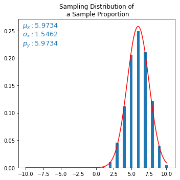
The question is, in "Sampling distribution of Sample Proportion", what would be the expected mean statistically from sample distribution? Should it not be 0.6 or p?
Best Answer
Your second chart is almost meaningful (it could be better on the interval $[-5,15]$ than on $[-10,10]$), except for the point that it is the simulated and approximation to the the distribution of the sample sum rather than the sample mean
You would expect the sample sum to be distributed with mean about $np$ and variance about $np(1-p)$ so standard deviation about $\sqrt{np(1-p)}$. With $n=10$ and $p=0.6$ these are $6$, $2.4$ and about $1.549$, close to your simulation
As your second chart shows, the density function of a normal distribution with these parameters comes reasonably close to your observed frequencies for the sample sum. But this is partly due to an ambiguity in your bar chart. The area under your normal density must be $1$, while your sample frequencies must add up to $1$, so everything looks good here largely because the bars have a spacing of $1$. You could imagine widening your bars until they touched each other making a kind of histogram, and each would then be of width $1$ so clearly the total area of the widened blue bars would then add up to $1$ matching the area under the red curve
None of this really works for the first chart of the sample mean. All the widths and spacings are $\frac1n=0.1$ times the widths in the second chart. The normal density would still need an area of $1$ so has $n=10$ times the height that it has in the second chart, while the simulated frequencies stay the same height in the two charts adding up to $1$ though if you widened the bars to a histogram then its area would be $\frac1n=0.1$
I can see three possible ways forward to try to save the first chart, none of them fully satisfactory:
try to divide the height of the red density by $n=10$ to match the blue bars; it would no longer be a pdf and so might be harder to program
try to multiply the height of the blue bars by $n=10$ to match the red density; these heights would no longer be frequencies (though if you transformed these bars to a histogram they would have a standard interpretation)
draw cumulative distribution functions rather than frequency and density; the chart would change from bell-shaped to S-shaped and you might then need to consider a continuity correction