I'm styling a popup using the className option in leaflet.
Here's the entire code:
<!DOCTYPE html>
<html>
<head>
<meta name="viewport" content="width=device-width, initial-scale=1">
<meta charset="UTF-8">
<meta name="author" content="eddiearni">
<title>example</title>
<link rel="stylesheet" href="http://cdn.leafletjs.com/leaflet-0.7.3/leaflet.css"/>
<script src="http://cdn.leafletjs.com/leaflet-0.7.3/leaflet.js"></script>
<style>
html, body { height: 100% }
#map{ width: 100%; height: 98%; }
.popup{background-color:firebrick}
</style>
</head>
<body>
<div id="map"></div>
<script>
var map = L.map('map').setView([37.769091, -122.467283], 18);
L.tileLayer('http://{s}.tile.openstreetmap.org/{z}/{x}/{y}.png', {
attribution: '© <a href="https://www.openstreetmap.org/copyright">OpenStreetMap</a>',
maxZoom: 20,
minZoom: 9
}).addTo(map);
var marker = L.marker([37.769091, -122.467283])
.bindPopup(L.popup({
className:'popup'
})
.setContent("I am a popup."))
.addTo(map);
</script>
</body>
</html>
and for some reason the styling shows up behind the popup, which is still styled according to leaflet's default CSS:
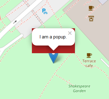
Shouldn't the .popup CSS predominate in the cascade?
Why is there a default styled popup over the background?
Obviously the default styles are still applying here, I'd love to learn how to override them, in order to create individually styled popups for different map features.
Best Answer
A popup in Leaflet is not one single
HTMLElement. If you use the developer tools in your web browser, you'll see that a popup has:A container for the whole thing:
(note how there's a margin on the bottom of the container; please also note that the behaviour of Leaflet 0.7 versus Leaflet 1.x in regards to this margin did change)
A wrapper for the content:
The element with the content:
The tip:
And the close button:
The important thing to have in mind is that the
classNameoption ofL.Popupis applied to the root element of the popup:Now, if your question would be a bit more like:
Then the answer would be: Now that you know that a popup is not a single HTML element, you can use CSS selectors for descendant elements to apply rules to more specific elements, like for example:
And it will look like:
Addendum: Keep in mind that you can read Leaflet's source code for its CSS rules and for
L.Popup, so you can see how everything is put together internally.