[GIS] Responsive design via an iframe for ArcGIS Java Script API 3.2

arcgis-javascript-api

Currently I am working on ArcGIS JSAPI ver 3.0/3.2 . I have created few maps in .html files then my IT admin putting this file in i-frame (at our custom site)

I am not using i-frame in my .html file. Interesting fact is that when I access the map on various device say (i-pad ,tab ,laptop ,mobile) my map is not resizing properly even I am testing in Firefox (Responsive Design View) its not resizing.

1.I have inserted the meta tags for i-os still its not resizing.

2.Checking the CSS also (CSS might not the issue)

3.Going though similar questions 1 , 2

4.Researching on this at my end

Any help/suggestions will be great.. thanks..

Complete code @ JS Fiddle

Update :

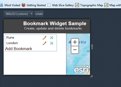
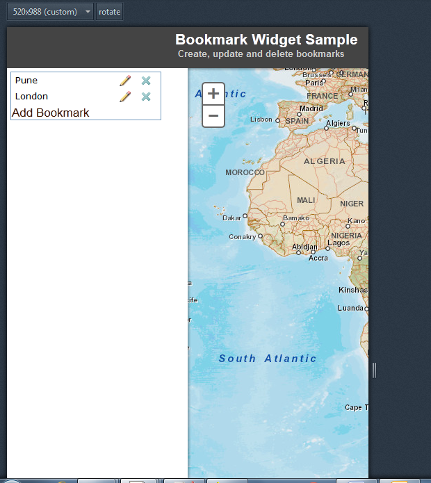
I am using the resizer code still facing display problem. Please check the screenshots.

test1

test2

Best Answer

You can use this code for resizing the map automatically:

 //resize the map when the browser resizes - view the 'Resizing and repositioning the map' section in
              //the following help topic for more details http://help.esri.com/EN/webapi/javascript/arcgis/help/jshelp_start.htm#jshelp/inside_guidelines.htm      
              var resizeTimer;
              dojo.connect(map, 'onLoad', function(theMap) {
                dojo.connect(dijit.byId('map'), 'resize', function() { //resize the map if the div is resized
                  clearTimeout(resizeTimer);
                  resizeTimer = setTimeout(function() {
                    map.resize();
                    map.reposition();
                  }, 500);
                });
              });

            }
Related Question