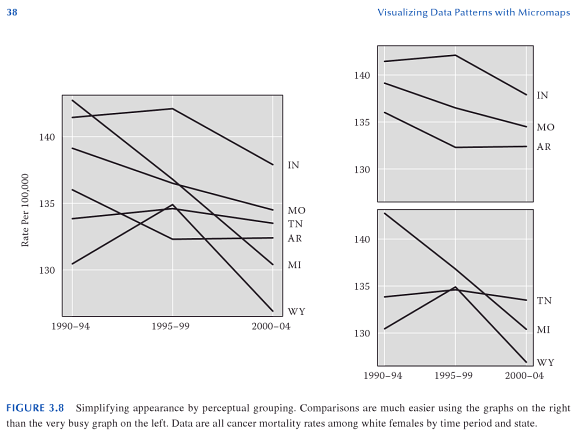
I've often seen discrete datasets plotted as line plots, but it occurs to me that the line infers a value at a point between the measurement intervals which is meaningless for discrete datasets. Is it therefore the case the using line plots for discrete data is wrong?
As an example, take two time-series datasets, one continuous (my weight, measured daily in the morning) and one discrete (the number of donuts I eat per day). It makes sense for the first dataset to be a line plot, as it is reasonable to infer that my weight in any given afternoon will be related to my weight the preceding and following mornings. However, if the number of donuts is represented as a line graph the lines between the dots no meaning can be inferred from that line.
EDIT
Here's another example: the Federal Hourly Minimum Wage Since Its Inception plot at http://mste.illinois.edu/courses/ci330ms/youtsey/lineinfo.html
Unless I'm mistaken, the minimum wage changes are discrete, and hence it's not possible to look up some arbitrarily selected time and establish the minimum wage at the point using the line interconnecting the dots.

Best Answer
Connected line plots have proven too useful to limit to a single interpretation. A few prominent uses: